Foyer, Chillingham Road Metro Station

-
Description
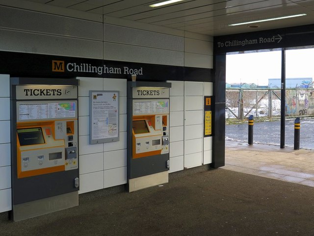
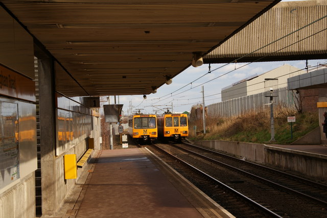
""In 2009, as part of Nexus’s 'Metro – All Change' investment programme, Newcastle-based design agency, Gardiner Richardson, was employed to overhaul the Metro’s branding. ...stripping back the Metro’s branding to its most basic elements: the colour yellow, and the Calvert typeface. Pretty much everything else on the Metro would be black, white, or grey, allowing the yellow to stand out as the only colour. "Signage is black with white lettering (in Calvert), and the station names are once again given alongside a Metro logo." "M is for… Metro" - Calvert typeface and the Nexus Tyne and Wear public transport visual identity: https://thebeautyoftransport.com/2017/04/19/m-is-for-metro-calvert-typeface-and-the-nexus-tyne-and-wear-public-transport-visual-identity/" Photo by Andrew Curtis, 2018. -
Owner
Andrew Curtis -
Source
Geograph (Geograph) -
License
What does this mean? Creative Commons License
-
Further information
Link: http://www.geograph.org.uk/photo/5657348
Resource type: Image
Added by: Peter Smith
Last modified: 7 years, 4 months ago
Viewed: 673 times
Picture Taken: 2018-01-18 -
Co-Curate tags


